Pantree
Project Overview
As a learning project to transition careers, I’ve designed a simple way to track what is in the fridge alongside what you need to buy for upcoming recipes.
Keeping track of the food in the pantry and fridge can be challenging when cooking at home. Household food waste leads to wasted money and an increased carbon footprint.
Tools used:
- Figma
- Invision
- Miro
- Procreate
Reflection
Throughout this design process, I saw the importance of gathering feedback and iterating with each step. The initial and final prototypes saw significant changes that vastly improved the user experience and reduced the number of clicks. The insight from interviews, user testing, and throughout the process from mentors, friends, and family was invaluable.
Looking back, if I were given a do-over of this process, I would hope to:
- Consider more targeted personas and their needs, including students, young adults living alone, couples/families, etc.
- Create more components and templates in Figma to streamline designing and save time
- Iterate again on the updated prototype with feedback from user
Discovery
1. Research
Through my research, I discovered the primary issues with household food waste and the common sources of the problem to address.
Issues:
- Waste of resources, money, time: 43% of food waste is due to in-home practices, as opposed to waste in restaurants, grocery stores, etc.
- Greenhouse gas emissions: Contributes to 8% of human-caused greenhouse gas emissions
- Guilt: Over 70% of people who throw out their food say they feel guilty about it
Key Takeaways:
The sources of these issues are mainly:
- Lack of education on food storage methods
- Confusing food labelling of “best by” and “use by” dates
- Poor fridge organization
2. Interviews
After my secondary research, I recruited interviewees to learn more about how they feel about household food waste and their home cooking and storage habits.
I reached out on social media with a preliminary survey and received 35 responses. After reviewing the responses, I contacted the interviewees who cooked at home.
I ultimately conducted six user interviews which informed the final design. From these interviews, I learned the following key takeaways:
- There is not enough education on how to store food properly
- Food waste feels bad for all interviewees, but the feeling does not stick for long
- Most people seem to believe that individual household food waste is negligible compared to that of businesses
- Planning meals and shopping trips reduces food waste, and not everyone does this

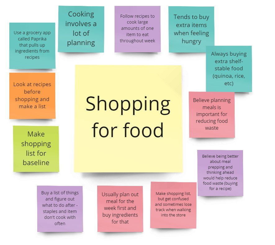
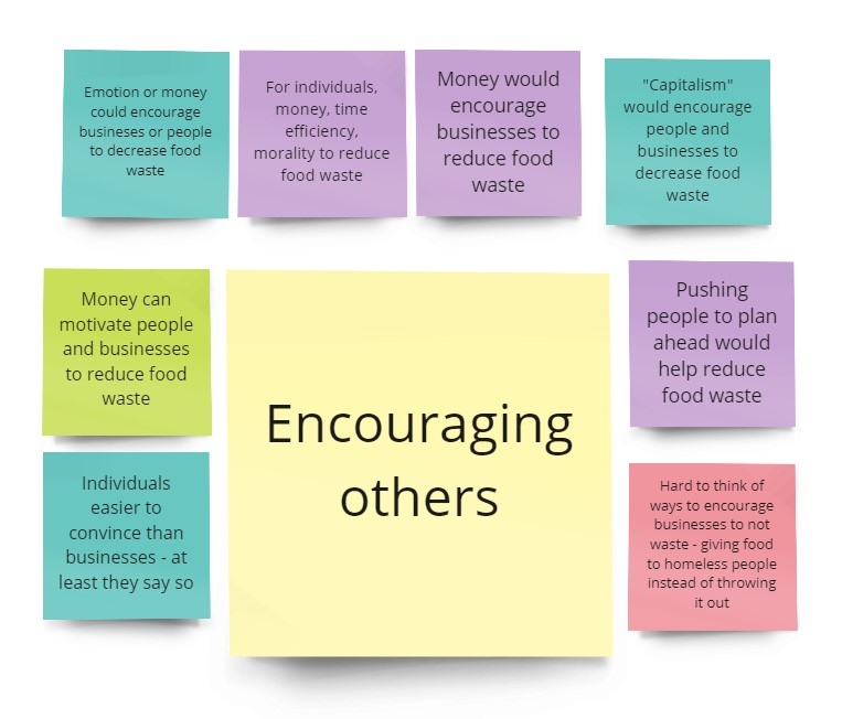
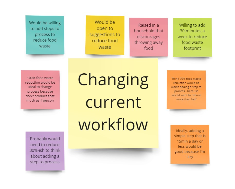
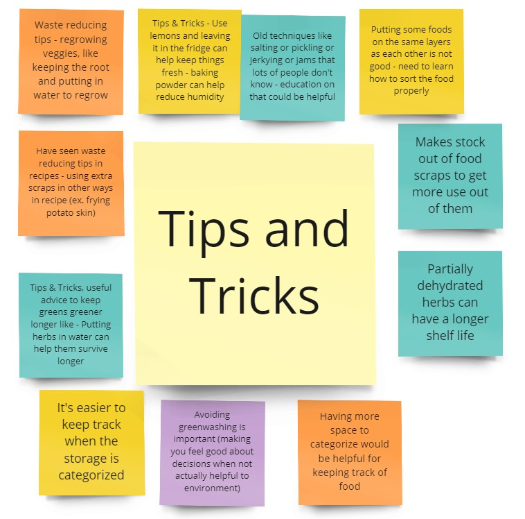
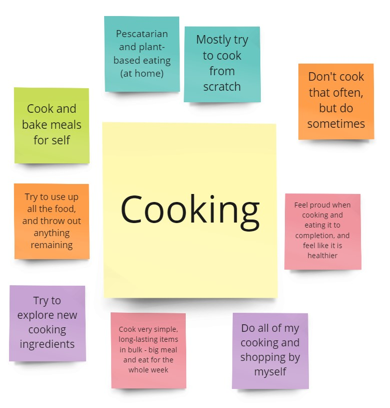
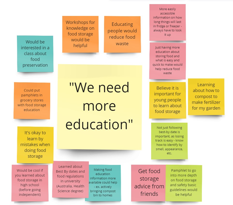
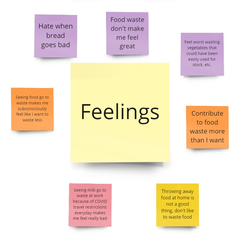
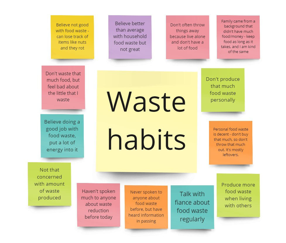
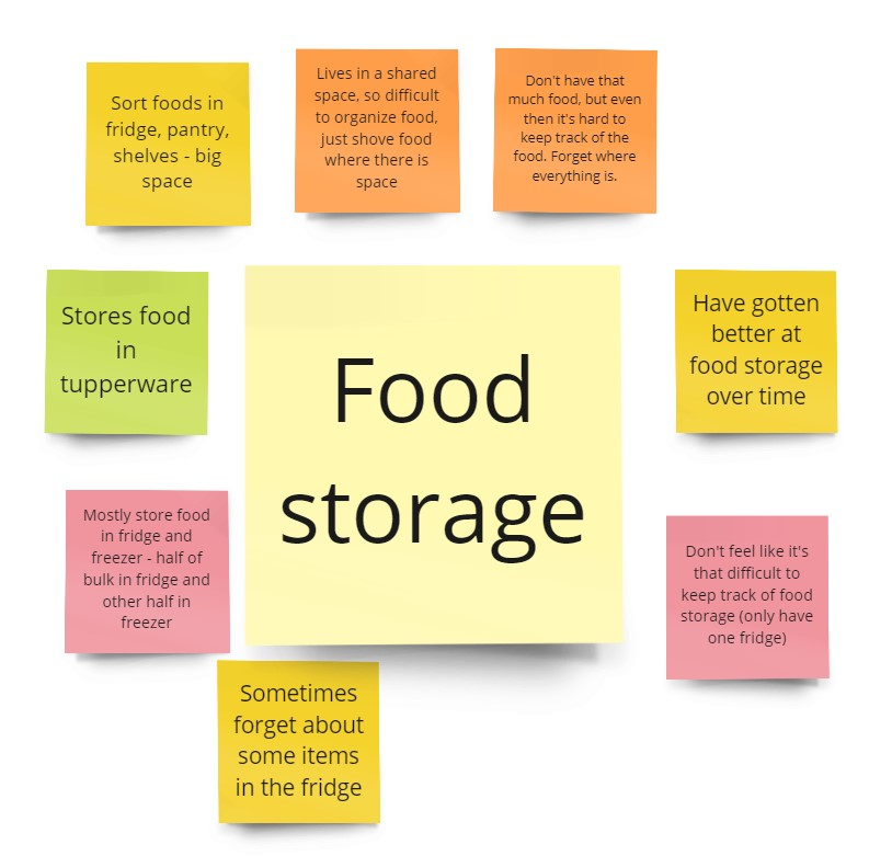
3. Affinity Mapping
I synthesised the data with the details compiled from interviewing, grouping it into key categories via affinity mapping in Miro. My primary goal was to determine users’ main pain points around food waste.
The affinity map can be found below. Click on a grouping for a more detailed view.
Key Takeaways:
- Again, there was a big focus on education
- Shopping and cooking habits have a big impact on the amount of household food waste
4. Personas
Based on the interviews/workshop, I set up two personas and referred to them throughout the product development process.
Key Takeaways:
- We can reduce stress by helping people develop a better relationship with their food storage
- We can improve knowledge sharing and meet needs of both groups by allowing the busy adults and environmentalists to interact

Ideation
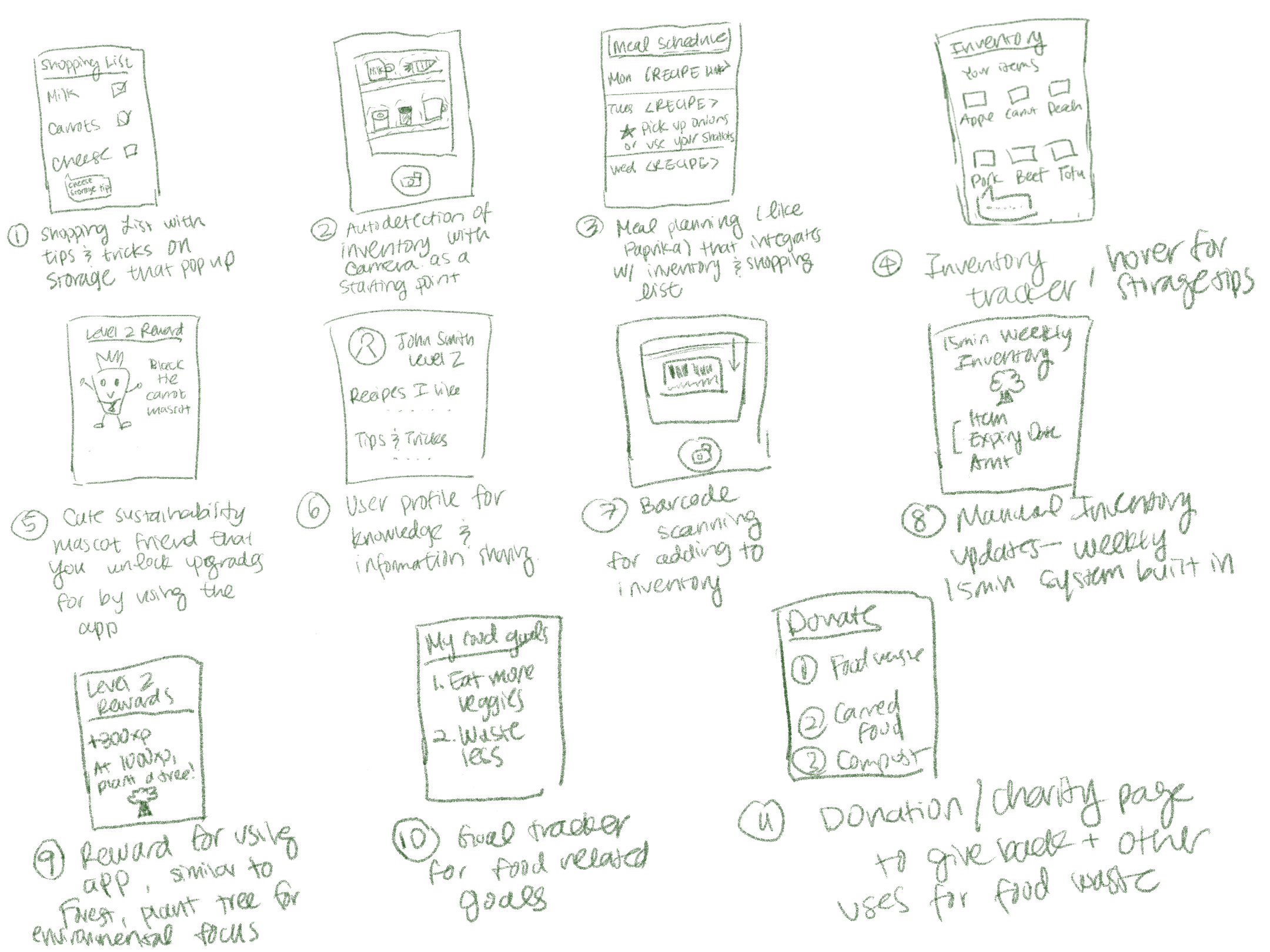
5. Ideate
I sketched several ideas for tools and applications to help address the problem statements. These sketches were done in Procreate.
Key Takeaways:
- There are many ways to manage an inventory list, but the theme among ideas is to make adding items quick and provide ease of use
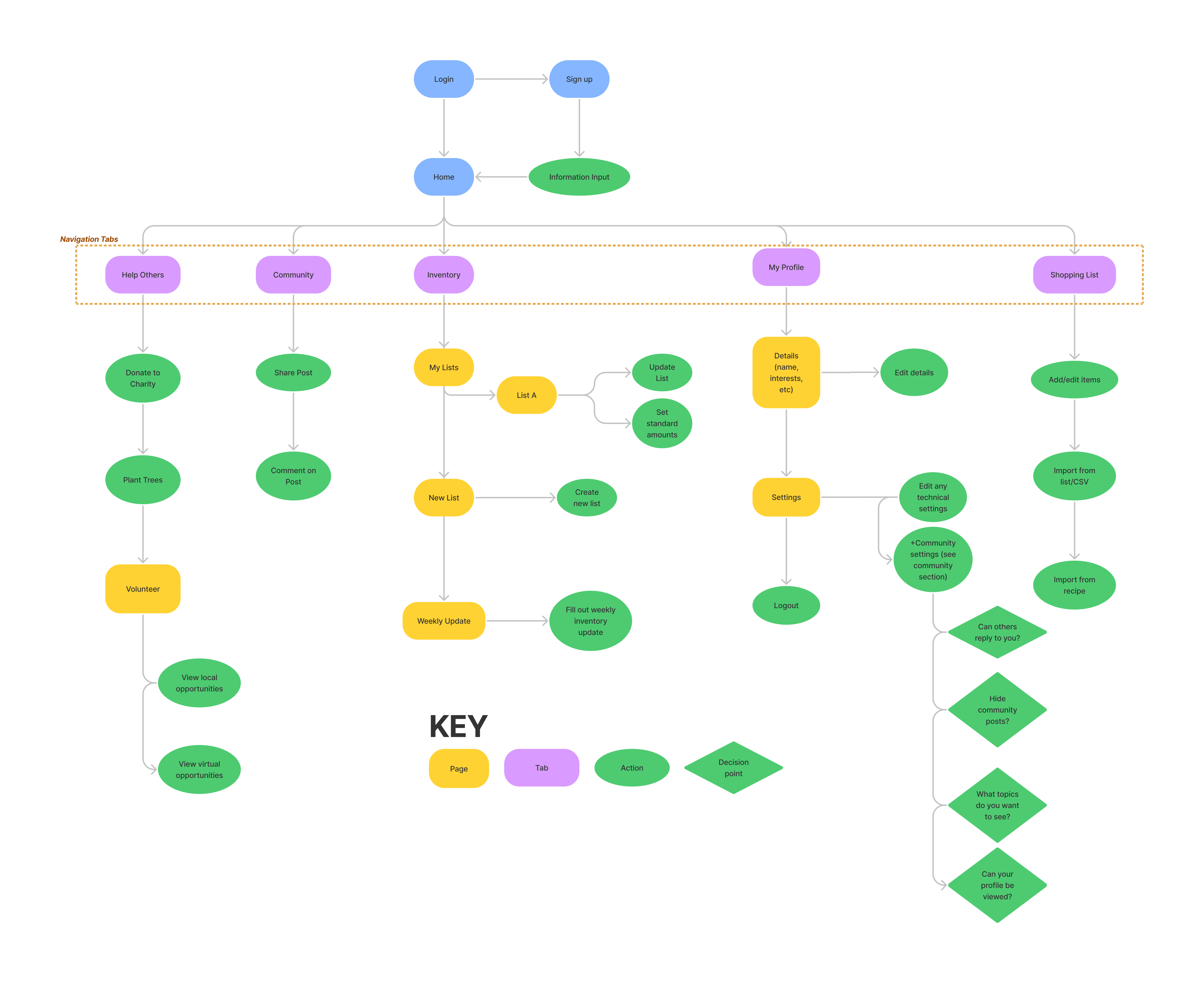
6. Site Map
I then brainstormed a preliminary sitemap for my project based on the workflows I had in mind. This took a few rounds of clean-up, as I originally had too many tabs.
Key Takeaway: After narrowing down features, the main navigation tabs I envisioned at this point in time were:
- Inventory tracking
- Shopping lists
- Community (Sharing knowledge)
- My profile
- Helping Others (Charity)
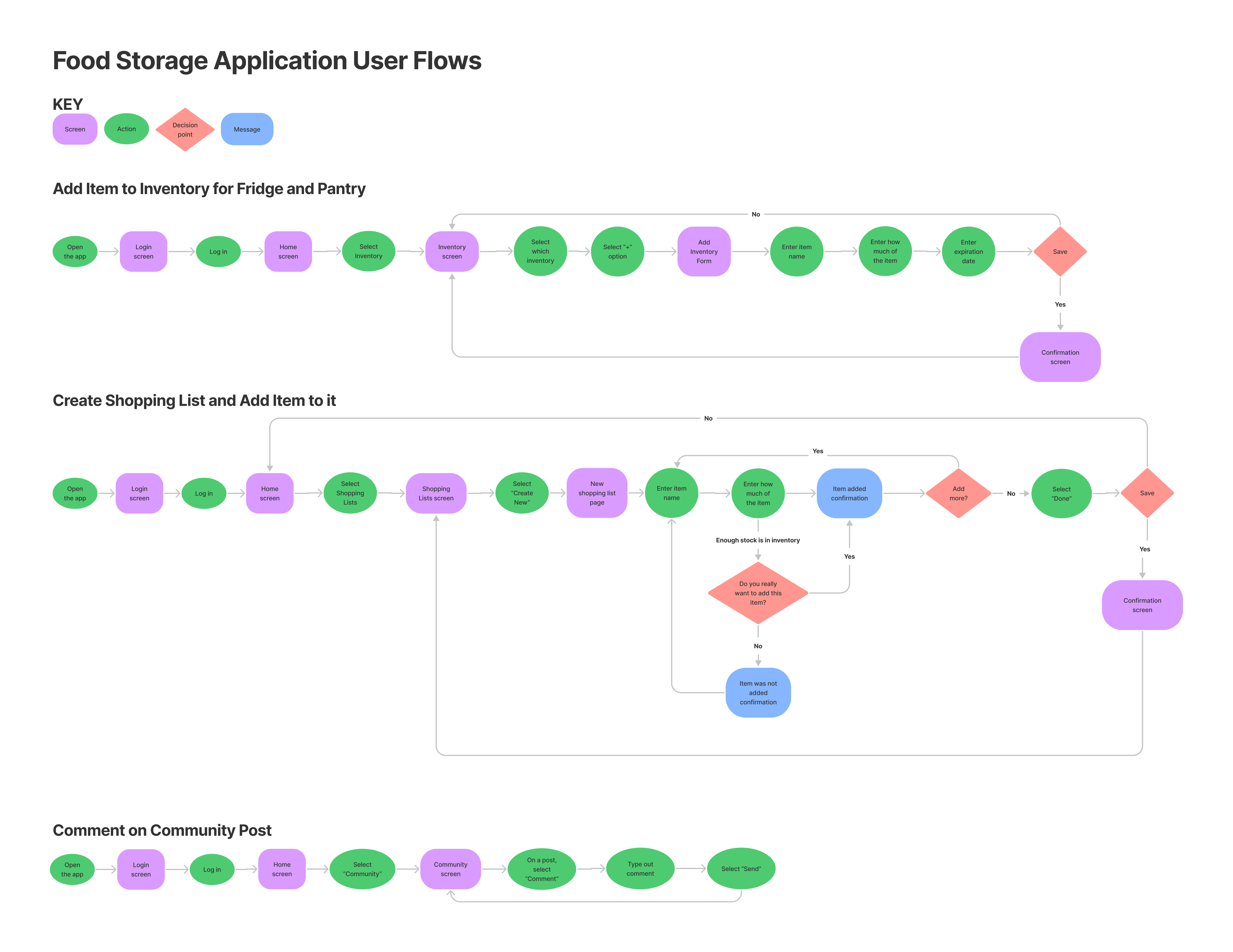
7. User Flows
Next, I selected three user workflows that would occur most frequently in the application and mapped out the user flows I envisioned. This included:
- Add item to inventory
- Create shopping list and add item
- Comment on a community post
Key Takeaways: The primary workflows in the app would involve shopping lists, inventories, and community knowledge sharing
Design
8. Wireframes
Based on the user flows above, I researched common UI patterns for these workflows and converted the sketches to low-fidelity wireframes using Figma. These were used to garner and discuss feedback. These wireframes underwent several iterations, particularly the homepage, which differed drastically from the initial sketches.
A few key wireframes can be seen directly below.
Key Takeaways: Navigation tabs were reduced to the main user flows. The homepage now summarizes the information users would most like to see when logging in.
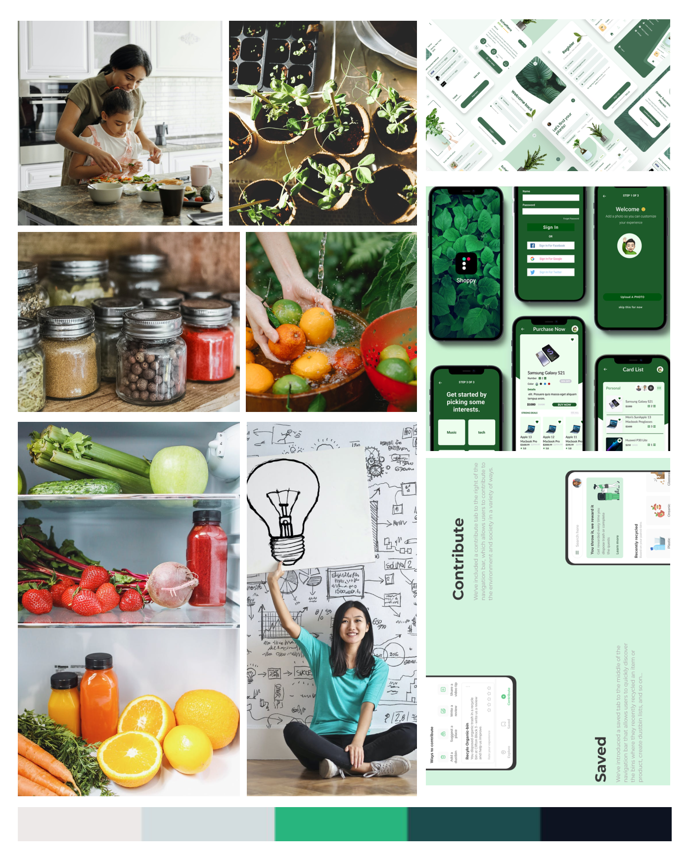
Mood Board
I then created a mood board to portray the visual aesthetic and personality of the brand.
I chose this imagery to represent:
- A sense of organization and tidiness in the kitchen
- Fresh and clean food
- Sharing of ideas and community
- Helping the environment
Brand Personality: Pantree inspires and gently encourages its users to learn the best food storage methods. We encourage generosity, sharing, and patience by providing resources to users and offering them ways to help their communities.
Brand Attributes: Informative, encouraging, organized, sincere, simple
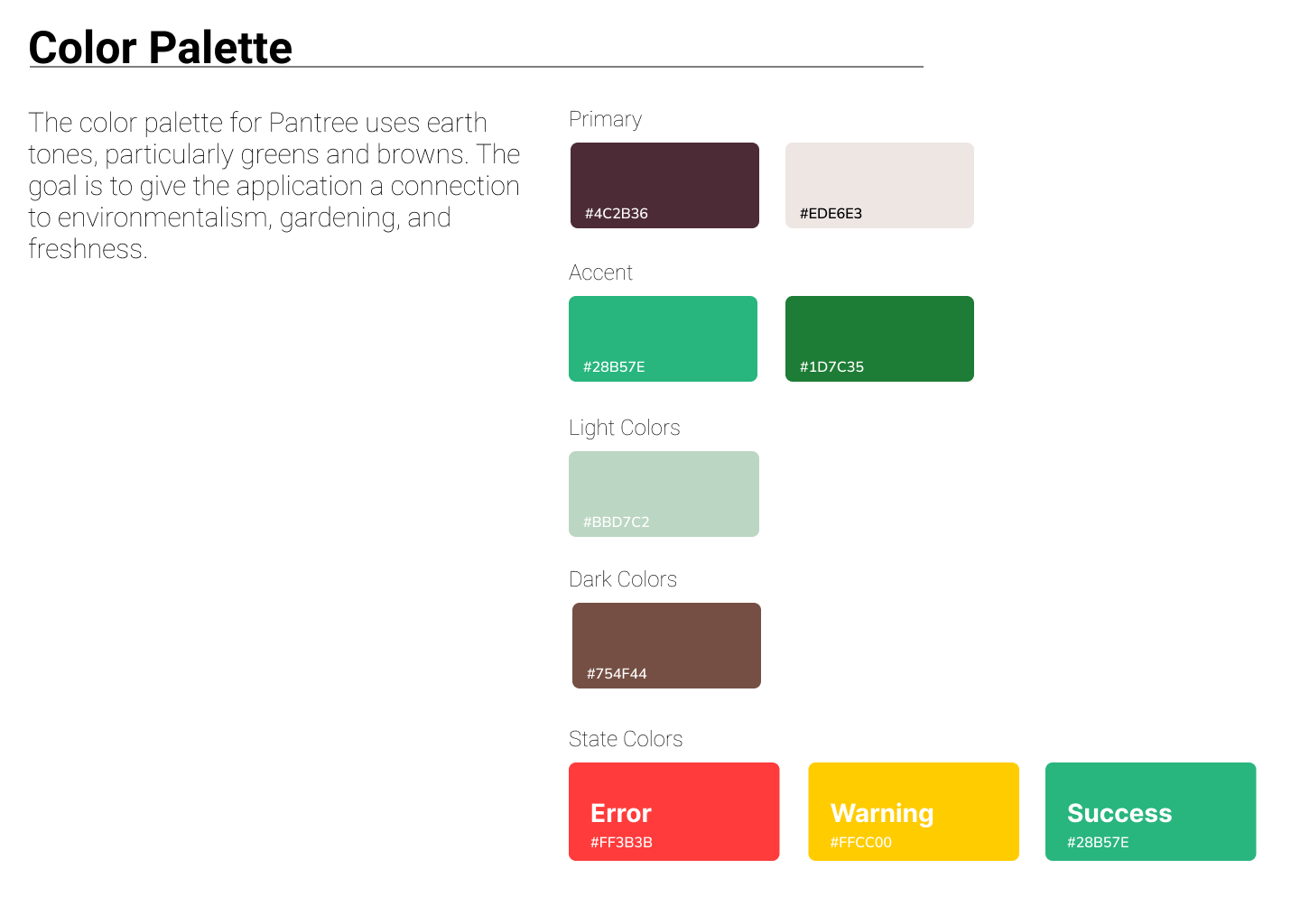
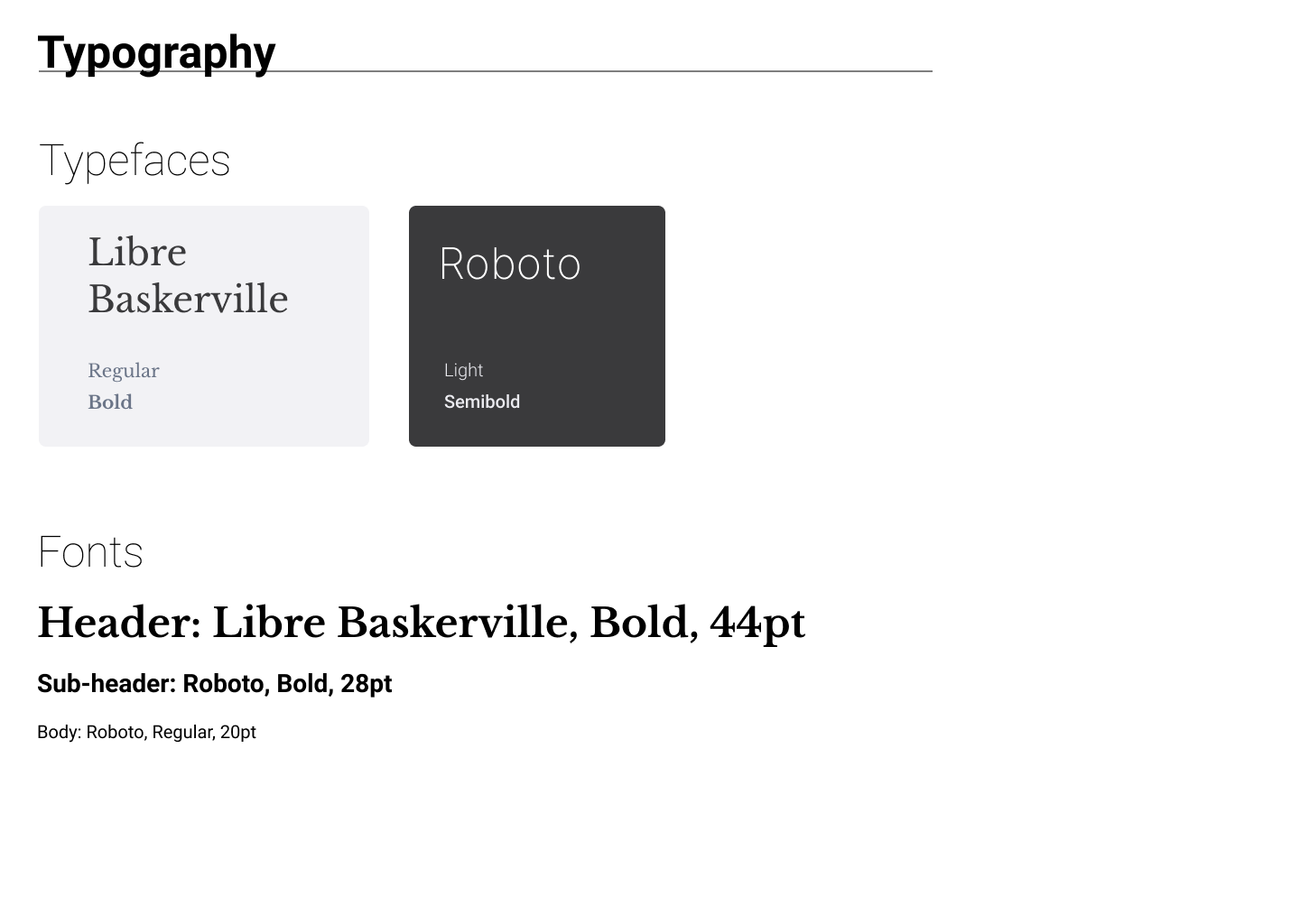
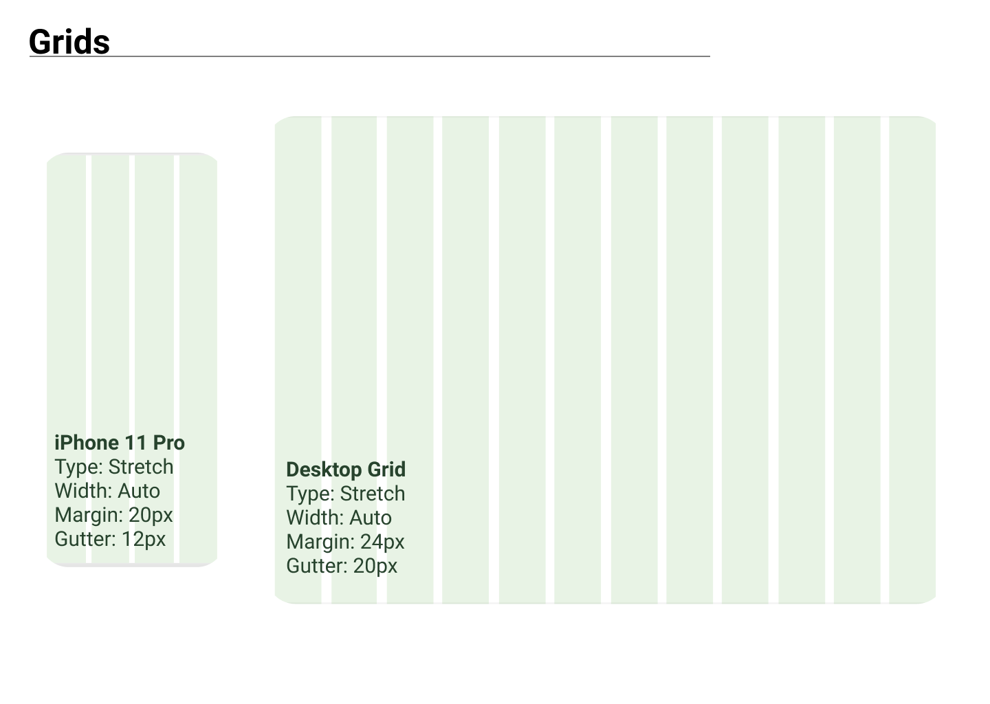
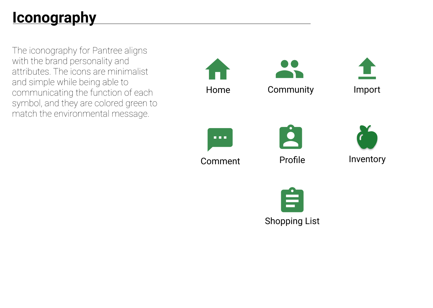
Design System
The moodboard worked as a guide to create a design system for the application below, including:
- Color palette
- Fonts
- Buttons
- Iconography
- Wordmark
Key Takeaways: The imagery from the moodboard was able to guide the creation of the design system for Pantree. Overall, the system is simple but clean and welcoming.
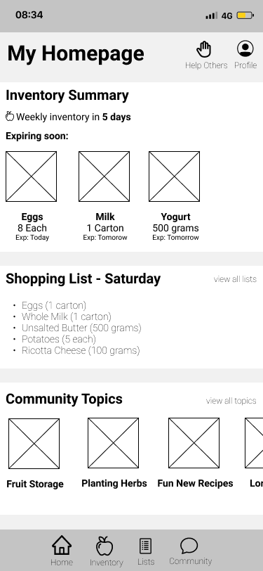
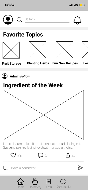
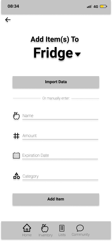
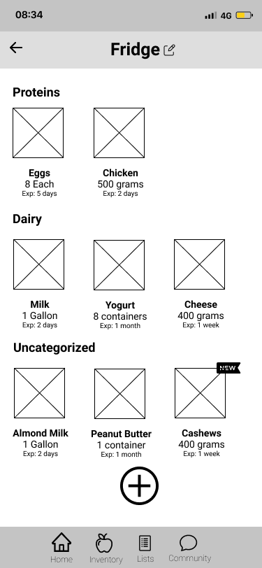
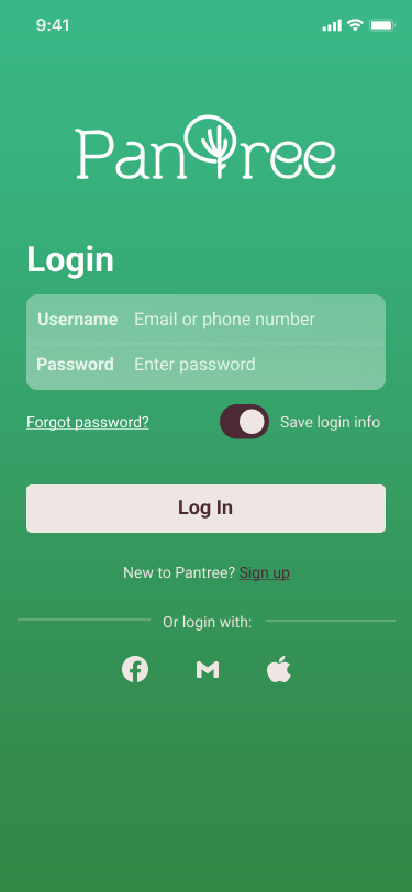
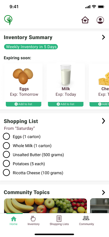
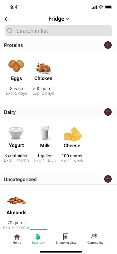
High Fidelity Screens
Next, I created high-fidelity screens for the application in Figma following the three user flows referenced above.
I used these screens to create an initial prototype in Invision for testing.
Key Takeaways: Getting feedback on these screens before user testing was greatly helpful, so user testing was as effective as possible.
Test
Usability Testing
At this point, I was ready to test with users. I wrote a usability test script and conducted testing on five people found through social media.
Test Objectives:
- Understand initial impressions of each screen
- Uncover usability issues
- Learn ways to improve users’ ability to navigate and understand how to complete tasks
- Discover user impressions about application usefulness
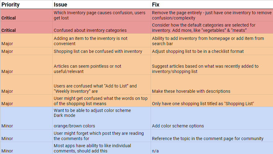
Test Results
Ultimately, I was able to uncover a list of usability issues that would significantly improve experience and prioritize them by importance.
All issues labelled Critical and Major were addressed in the final design.
Key Takeaway: User testing on the prototype lead to major improvements to the shopping list and inventory workflows
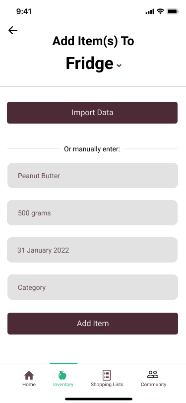
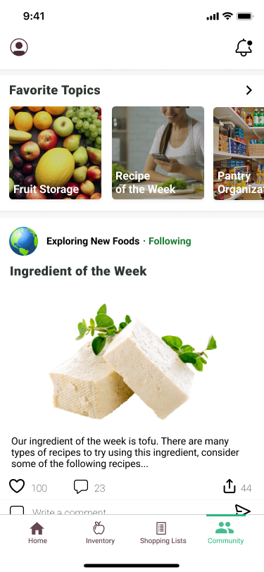
Final Prototype
Addressing all major and critical issues involved redesigning screens and workflows.
The shopping list screen was overhauled and quicker workflows for adding items both to inventory and shopping list were added.
Additionally, a pop-up notification was added to the community screen to notify the user when it is updated.
Key Takeaways: The number of clicks to add items to inventory and shopping lists was reduced significantly.
Next Steps
If I were to continue with this project, I would consider addressing some of the minor issues found in testing. After that, I would do another phase of usability testing and high-fidelity updates. Ideally, I would do this with the same people as before and new participants.
From there, I would love to move forward and develop this application!